

Promovideo Snelstart Kanskit
Client: Snelstart | Agency: Klomp
Klomp reached out to me asking me if I would be able to create a high end promotional video for the event on relatively short notice at which their client Snelstart would be presenting their new limited edition accountancy kit. Available to me was existing live-action footage of existing videos they had made for Snelstart.
After looking into the goal of the project as well as the brand together with Paul, taking into account it's strengths/values, and the general traits it seemed to have within its effective position in the market, we wanted to create a general feeling of professionalism, modern efficiency, clarity combined with some element of mystery and maybe a touch of something that hints at the sort of legendary status of high-end superiority if you will. Another variable of interest in this context was the method of engagement; a focused presentation with seated guests on a large screen.
To get this across, I felt that the music would weigh in heavily and should not be underestimated in it's importance especially for this edit. I spent some time looking for the right energy, imagining the visual concept while listening through many options, and then decided which track was perfectly suitable. I carefully picked out what I considered to be shots that would complement the concept and put it all together.
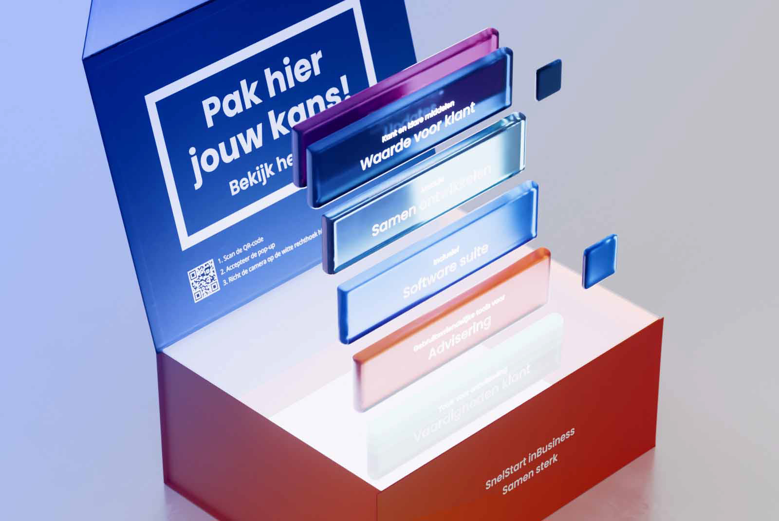
I modelled the product (in terms of its physical existence at least) in 3D, making sure to add very subtle imperfections to it's geometry, thereby pushing it's realism to the top percentage points of photorealism.
An important aspect which I believe works really well in videos like these, (where its only music and no voice-over) is the consequent cut at the exact beat of the soundtrack.
I needed to find a way to visualize the (obviously non-physical) "actual" product which are their digital accountancy tools in a way that would make sense to the viewer and would not take away from the more obvious visual content prior to that part of the film. I felt that the best way to abstractly visualize a sense of quality, depth but yet clarity, would be sheets or panels of glass with textual descriptions on them. I found that unfolding the array of services this way in different colours translates the concept of the broad spectrum of value the best.
Both agency and their client were very happy with the result.