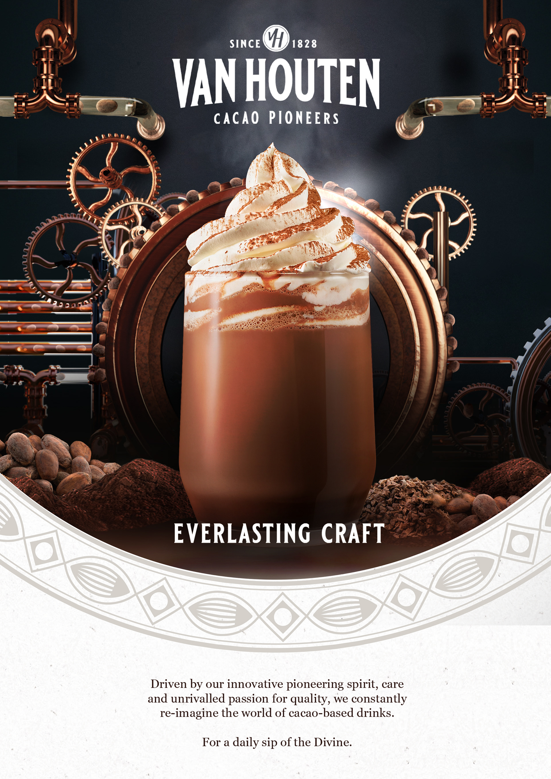

Agency: SGK | Client: Van Houten
SGK asked me to assist in designing the key visual for the rebranding of Van Houten Hot Chocolate.
They had already developed several designs and received multiple rounds of feedback, but the client was not fully satisfied with the latest versions.Initially, I was tasked with following the existing design trajectory closely, adhering to previous discussions and client expectations. However, I proposed creating a second option that diverged from some earlier design choices. After discussing this with their team and incorporating their feedback into my proposal, they agreed to let me design an alternative concept.
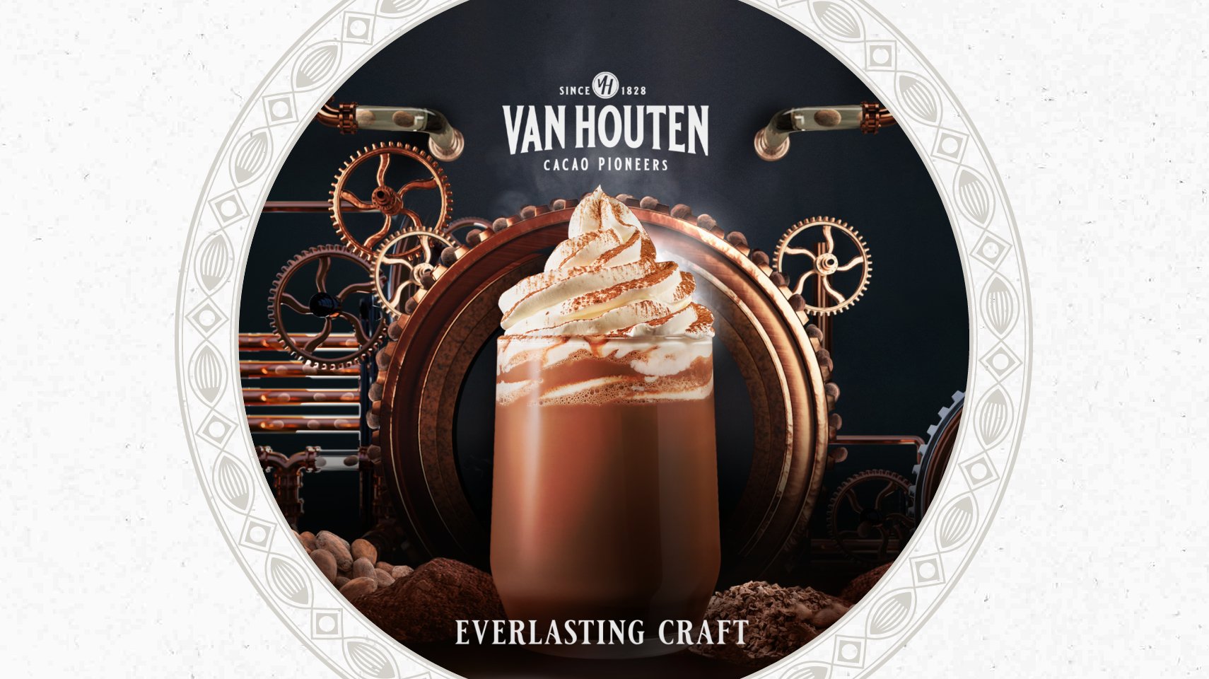
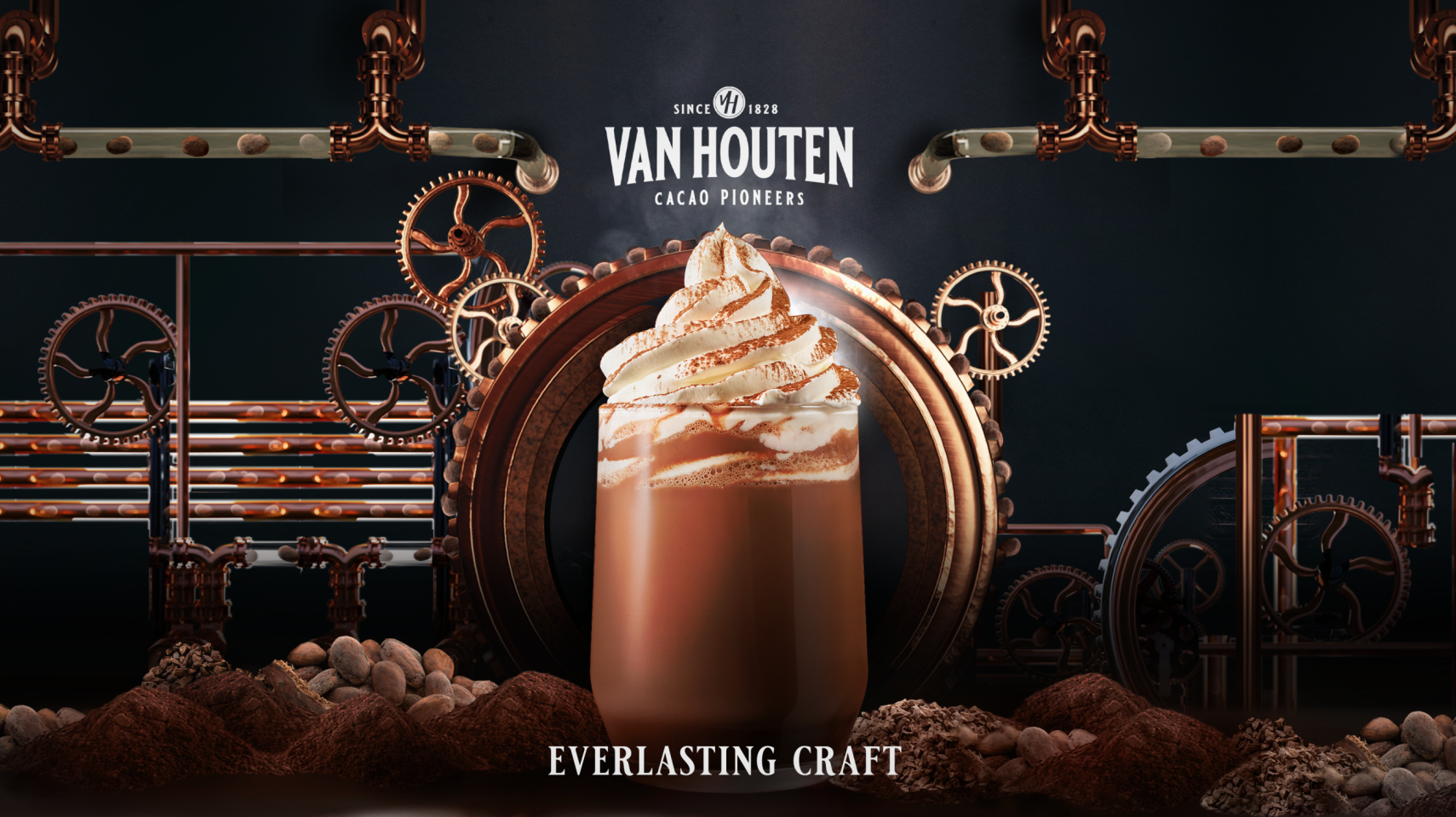
To visually convey the craftsmanship and authenticity of Van Houten—as one of the first high-quality producers in this market—I aimed for a balance between their rich history and modern relevance. I created a new design that retained some elements from the previous version but transformed them with realistic texturing and shading. I ensured that all components in the scene felt cohesive by harmonizing light and layering objects in a parallax effect to create depth.
Upon receiving both options, the client responded enthusiastically to my alternative proposal, requiring only minor adjustments. I then created multiple versions suitable for social media following SGK's direction and made different animated versions.